

Company & Sector
The Washington Post - Design Systems
Role
Lead Product Designer
Team
Chelsea Brown, Design Lead
Ashley Tolen, Lead Engineer
Timeline
January 2025
Tools & Skills
Figma, Component Building, Interactive Design, Systems Thinking, Design-Engineering Collaboration
Project Overview
I led the design of a versatile pagination component for The Washington Post Design System during an 8-day sprint, creating four distinct variants to address critical inconsistencies across the platform.
Highlights
⟡ Completed an 8-day component sprint with lead developer
⟡ Facilitated a discovery workshop with design systems team members and stakeholders
⟡ Demonstrated component interactivity through prototyping
⟡ Improved SEO by 134% with the new component launch on landing pages
My Challenge
How can I design a pagination component that works across multiple use cases and levels of complexity?
The challenge began with improving SEO on author and section landing pages. When the SEO team discovered we lacked an existing pagination component, I audited pagination patterns across our site. The audit revealed that pagination worked differently across our products, which confused readers and created maintenance challenges for both design and engineering teams. A single, flexible component would simplify implementation and improve the user experience.
My Vision
Not just a component, but a scalable system
I envisioned creating a unified system that would serve as the gold standard for all content navigation, capable of handling everything from simple article navigation to complex data tables. After analyzing user patterns and technical requirements, we established three core objectives
⟡ A unified system with an intuitive pagination system that works seamlessly across our entire website
⟡ Scalability to be utilized for a range of different content while maintaining responsiveness across devices
⟡ Usability to ensure straightforward integration and seamless adoption by product design and development teams
The Process
Delivering a tall order in an 8-day component sprint
Following design system contribution guidelines, I completed a focused 8-day component sprint to build the pagination component. I worked with our lead developer, Ashley Tolen, to define requirements, ensure accessibility, and refine the design. Regular check-ins and documentation milestones helped us create a component that met our quality standards and technical needs.
Day 1: Research and Analysis
Together with our design lead, we ran a 1.5-hour kickoff workshop for product design and engineering stakeholders. We audited existing pagination patterns, documented use cases, and defined key interaction patterns and accessibility requirements.
Documentation from our initial workshop combining collaborative brainstorming (left) to define pagination requirements with examples of pagination patterns from other company design system pages and websites (right) to inform our component design approach and accessibility standards.
Day 2 - 3: Design Exploration
Working alongside another product designer, we explored multiple iterations of the pagination component, examining various states, including default, hover, active, and disabled. We focused particularly on mobile interactions and edge cases.
Evolution of the pagination component design, from initial concept exploration and button style adaptation (left) to refined component specifications with detailed anatomy and implementation options (right).
After carefully studying the different use cases and scenarios that our pagination component needed to accommodate, I built and developed four distinct types of pagination variants for our system:
No Display: A minimalist design with simple previous/next navigation for basic content flows
Compact: Adds streamlined controls while keeping a small footprint
Descriptive: Features clear labels and enhanced navigation for better usability
Numeric: The most comprehensive option, displaying page numbers and full navigation controls
The Numeric variant was the most sophisticated to build, using complex logic to dynamically display page numbers based on the user's position. It handled various edge cases by showing appropriate ranges near the start and end of content, offering multiple-page skip options, and clearly indicating the total number of available pages.
Pagination component system in Figma showing the main component and the subcomponents, demonstrating increasing complexity while maintaining design and accessibility standards.
I created detailed Figma prototypes showing the pagination component's behavior across different scenarios. Using advanced prototyping features, I demonstrated how the system responds to user interactions, including hover states, active selections, and page transitions. These interactive prototypes helped our development team understand the intended behavior, particularly for complex scenarios like dynamic page updates and content loading states. The prototypes included comprehensive documentation of states, patterns, and accessibility requirements.
Interactive prototype showcasing four pagination variants with increasing complexity: No Display (minimalist UI), Compact (basic controls), Descriptive (labeled navigation), and Numeric (detailed page indicators). Each variant demonstrates its behavior and design patterns in both light and dark modes.
Day 3 - 7: Technical Collaboration
The lead developer and I held regular check-ins, where we refined the component's architecture. We focused on optimizing performance while maintaining design integrity, addressing state management and load handling.
Day 8: Documentation Development & Handoff
I created comprehensive documentation with usage guidelines, implementation examples, and accessibility requirements to ensure consistent adoption across teams.
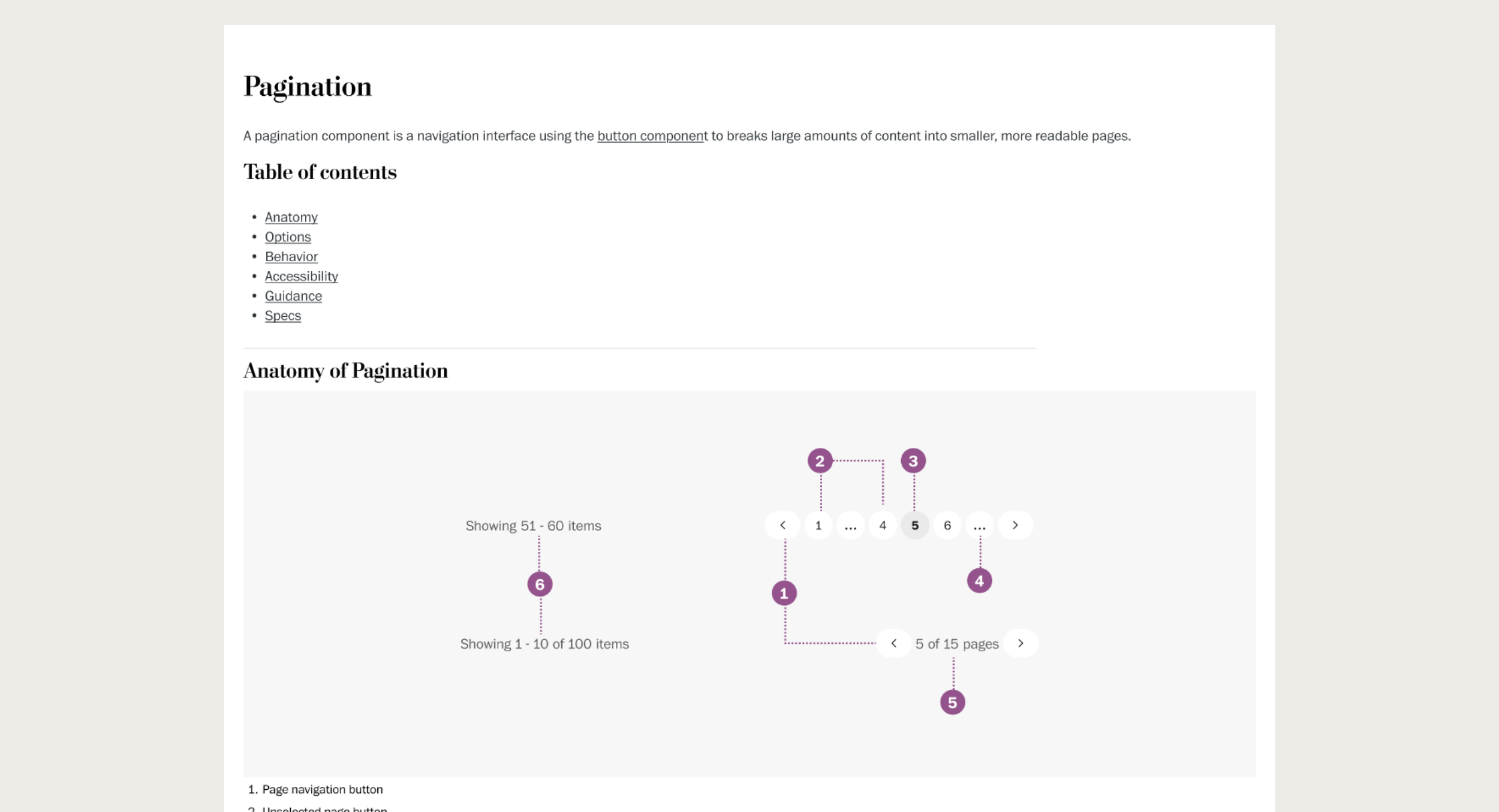
Component documentation illustrating the core elements and structure of the pagination system. The anatomy breakdown helps developers and designers understand each interactive element's purpose and relationship within the component.
The Result
Testing the versatile pagination system for SEO improvement
The pagination system was successfully implemented into our design system, and launched onsite for author and section fronts in June 2025. Implementation significantly improved our SEO for author and section landing pages. The indexible pages increased almost by 9,500 after launching pagination onto author and section pages.
Pagination implementation dramatically improved SEO performance:
+9,500
more indexible pages
134%
increase from pre-launch baseline
What I Learned
Scaling designs can scale solutions
This project demonstrated a key principle in design systems work: the best solutions address immediate needs while anticipating future ones. What started as a focused SEO challenge evolved into a comprehensive navigation system for other use cases.