

Company & Sector
The Washington Post - Newsletters
Role
Lead Product Designer
Team
Stephen Mefford, Product Manager
Benjamin Djang, Developer
Timeline
Dec 2022 - Dec 2023
Tools & Skills
Figma, Litmus, Email Design, Responsive Design, Systems Thinking, Component Design
Project Overview
I created a comprehensive newsletter UI kit in Figma that standardized components and templates across all newsletter designs, establishing a single source of truth that dramatically improved workflow efficiency.
Highlights
⟡ Designed one modular template system to accommodate 100+ newsletters
⟡ Mapped color tokens across email platforms
⟡ Reduced newsletter production time from hours to minutes
⟡ Enabled seamless collaboration between product design, editorial and development teams
My Challenge
Designing blind (and without any existing files).
When I joined The Washington Post as the sole product designer for newsletters, I immediately encountered a digital ecosystem lacking essential structure:
⟡ No design files or standardized newsletter system existed, forcing designers to rebuild components from scratch for each project. We couldn't leverage our main WPDS (Washington Post Design System) because of strict email code limitations
⟡ Editorial teams worked without consistent templates or source files, causing significant production inefficiencies
⟡ Design inconsistencies and lengthy timelines undermined newsletter quality and brand cohesion
⟡ Email platforms' varied dark mode implementations prevented us from effectively previewing design changes before development
My Vision
A single source of truth: The Washington Post’s first newsletter design system
Envisioning our first newsletter design system required me to deeply understand both the editorial team's creative needs and the technical constraints of email platforms. My vision focused on:
⟡ Creating a unified design language that would empower editors to maintain their distinct newsletter voices while ensuring brand consistency
⟡ Developing flexible components that other designers across departments could easily customize without starting from scratch each time
⟡ Building intuitive templates that would reduce production time and allow teams to focus on content quality
⟡ Establishing clear documentation that would facilitate seamless collaboration between design and editorial teams
The Process: Part I
Dissecting our newsletter templates, and identifying opportunities
I conducted a thorough audit of our current design patterns. My approach to creating a newsletter design system involved adapting our main design system (used for web and app) to be more HTML and email platform friendly.
To break down the newsletter modules into components, I first conducted an audit of our existing system. I identified common elements that appeared consistently across newsletters, such as headlines, article previews, and promotional sections. By analyzing how these elements were currently being used, I was able to design flexible components that could serve multiple purposes while maintaining design consistency.
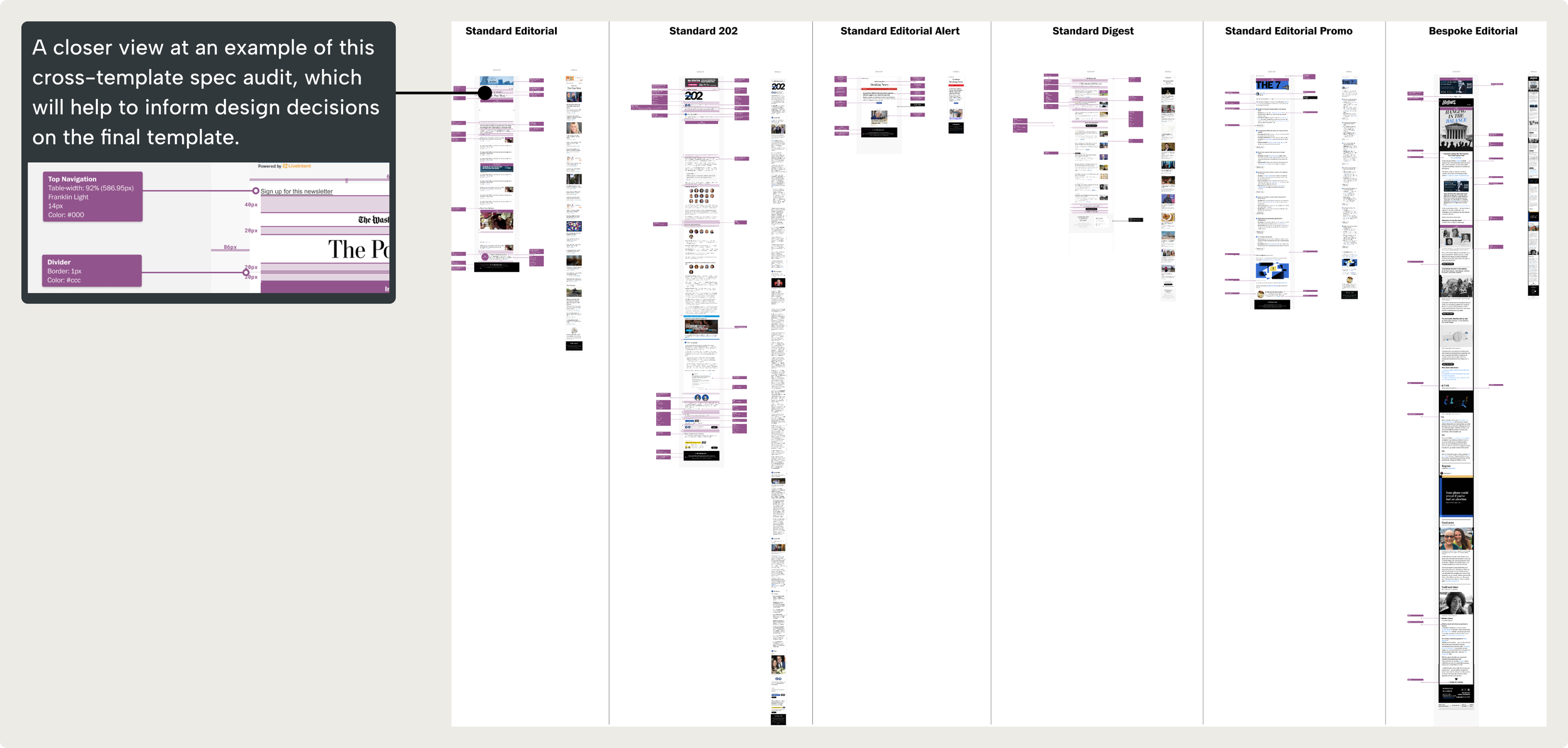
The image shows a detailed cross-template specification audit comparing different newsletter layouts for The Washington Post. The magnified view shows that design specifications were analyzed, highlighting elements like header formatting and spacing measurements.
The Process: Part II
Building the system from the foundation up.
I built the component system from the ground up, starting with foundational elements like typography, spacing, and colors. Building on this base, I developed larger components including article cards, content sections, and headers. I established clear customization rules that let teams maintain their unique newsletter styles while staying within our design system guidelines.
The canvas component serves as the foundation of my modular newsletter system, featuring customizable slots that designers can populate with various content components. This flexible architecture allows teams to build newsletters by combining pre-built elements while maintaining design consistency. The left layers panel displays the component library I created specifically for newsletters, while the right panel shows these components available for assembly within the template structure.
A key challenge was adapting color tokens for dark mode across different email platforms. Since each email client has unique rules for enforcing dark mode, I used Litmus to systematically map and adapt our colors for consistent display across platforms.
Documentation of WPDS color token translations in forced dark mode scenarios, showing how our design system colors adapt across various email platforms. The mapping includes specific hexadecimal values for both app and mobile web implementations to ensure consistent rendering across different contexts.
Comprehensive view of newsletter template variations with a detailed breakdown of color mapping between modes. The zoomed section illustrates how our design system colors adapt when email clients force dark mode. While we have limited control over how colors translate in forced dark mode across some email platforms, we've carefully accounted for potential accessibility issues by adjusting graphics, text treatments, and color combinations that typically don't render well.
Example treatments showing how newsletter design elements adapt between light and dark modes across various email clients, demonstrating consistent visual hierarchy while maintaining readability in both themes.
Views of The Washington Post's typography system, which is implemented as text styles in Figma. The text styles were mapped to define their relationships as they translate from our website experience to newsletter formats. This helps maintain visual hierarchy and consistency when adapting content across different contexts and layouts.
Through close collaboration with engineering and product design teams, I refined these components through iterative feedback sessions, creating template variations that supported different content strategies while maintaining visual consistency.
The Result
A centralized source of truth for newsletter design and beyond.
The UI kit rollout yielded immediate results aligned with our vision. Design times shortened dramatically—tasks that took days now took minutes. This efficiency gain streamlined our process while maintaining visual consistency.
The impact extended beyond our team as departments across the organization adopted it as their source of truth. This widespread adoption validated our flexibility goals, creating versatile components that served diverse editorial needs. Developers received clear guidelines that eliminated back-and-forth questions, improving collaboration between teams and allowing everyone to focus more on content quality than technical implementation.
A few instances where the newsletter design system assisted or was adopted by teams across the company:
Advertisement & Monetization
Advertisement placement
Migrated the “Recommended For You” newsletter over from an outdated template
Personalization
Washington Post Intelligence
Launched new branded newsletter
Migrated the popular newsletter over from a bespoke template
The 7
What I Learned
Discovering design system debt for the first time.
This design system kit required a long, iterative approach—even years after we launched the new template. I initially created it to streamline my own work, but soon realized other teams would benefit from having a central resource for newsletter template designs.
Not every designer has experience with our internal newsletter software or access to Litmus, so I set out to build a library that designers across the organization could use. When I transitioned from the newsletter template team to design systems in 2024, I applied my knowledge of library structure to refine the system further. Since newsletters was an established product that would no longer have a dedicated designer, design debt accumulated with each code iteration.
I spent several days (whatever rare time I could spare) between 2024 and the end of 2025 refining and updating the component library. The work required significant design time, and this experience taught me just how critical design systems maintenance truly is.